
Want to receive post like these in your inbox? You can subscribe! It's free.
After listening to Craig Federighi’s talk on how to be a better software engineer I was sold on the idea that it is super important for a software engineer to learn the basic principles of software design.
For this reason, I embarked upon a journey to cross my lane and learn design and user experience and open myself to new ideas and possibilities. While I am nowhere near the journey’s end, I did manage to pick some fundamentals along the way for UI design that will help me for the days to come.
In this article, I will recap and mention these fundamentals and what I learned while working on a new UI design project in Figma. A web based, massively collaborative and easy to use design tool.
In conclusion, this article points to the importance of maintaining a design system for UI development for any project, big or small. A design system keeps you as a designer sane when it’s easy to get lost in your creative ideas.
Consistency requires work
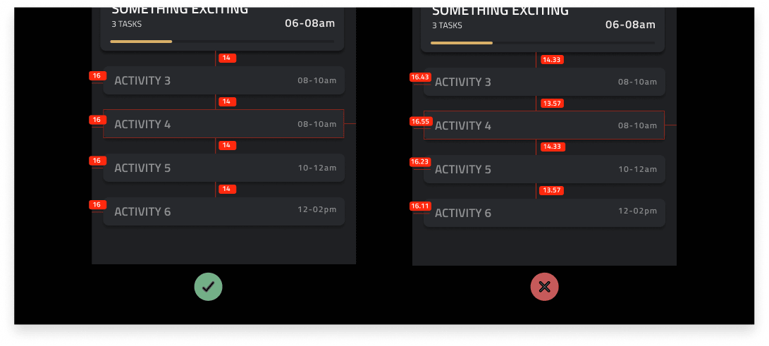
If there is only one rule for designing interfaces it is consistency. Consistency is essential not only for your design to look and feel good but also because it encourages stability and fluidness between development and design teams.
As a designer you’ve heard of this before. I surely did, but what I didn’t know was that consistency requires work. It is easy to be inconsistent and move fast. However, being consistent is essential for a design to be successful.
For example, if you are using 16pts padding for your modals then you must use it with every other modal in your design. Similarly, your colors, paddings, alignments, typography, shadows and assets need to be consistent throughout.
This is where design systems come into play. Design system lets you pre define your colors, typography, shadows, icons and alignment which helps keep every stakeholder on the same wavelength.
If you’re using Figma for designing consider using Pixel Perfect plugin which helps round position and dimensions of all selected layers.
Name your elements smarter
Being consistent in your UI design goes a long way, but what also goes a long way is how you name your UI elements and components. As a developer I absolutely dreaded when a designer would send Sketch files without proper naming conventions.
A consistent naming convention can save not only your time as a designer but also your developers’ time when the design gets to see the light of day.
For you as a designer and design team, a good naming convention means it is easier to make sense of what you are working on and allows you to make rapid changes without breaking anyone else’s work.
I like the idea of dividing your design system components and subcomponents as atoms, molecules and compounds which are the conventions of atomic design, a principle famous in the development community.
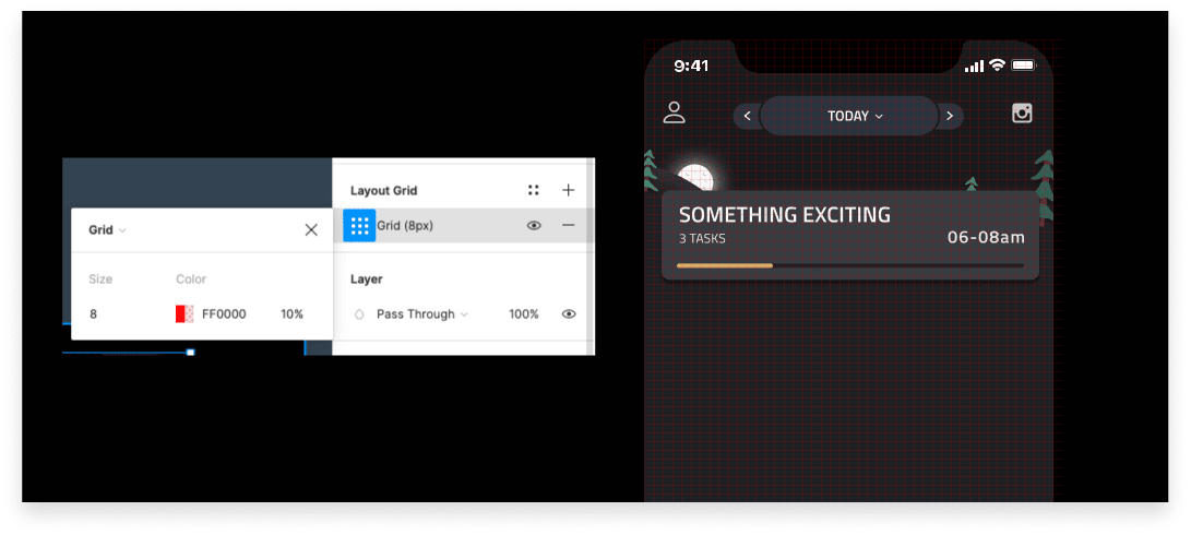
Don’t go off the grid!
Before jumping on your creative wagon and producing the best designs of your life, consider investing in a grid system. Grids are great because they enforce a consistent design across the team. As individuals they help you iterate much faster as the grid allows you to snap UI elements in the right position.
Make grids an integral part of your design system. On the web a 10pts grid is often used. On mobile platforms 8pts grid works like a charm.
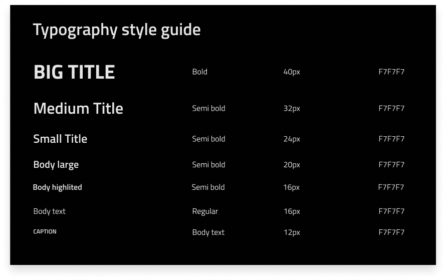
Determine font sizes
Now every time and again, you will need a headline text or a caption text which is smaller than normal. So decide all of your fonts before moving on to building your prototype. You will save a lot of time and ensure consistency. Your colleagues will rejoice in you and your future self will be very pleased.
Avoid small body text
Have you ever seen a mobile app with fonts that you can’t read? That is absolutely a no go. A rule of thumb is to use at least 16 points for your body text on mobile designs. A readable text goes a long way as there are people who struggle to see smaller fonts.
Give people what they want
Also known as, design for accessibility. When designing it is super important to consider the fact that you are designing for a vast variety of people. People have different needs. For example, some people use Android phones, others use iOS. Some people like dark mode, others don’t. Some people like big fonts while others prefer smaller.
The more choices you can provide to your user the better it gets. For example, on Android the standard button height is 48 px while the clickable area is 48x48, while for iOS the standard button height is 44 px and the clickable area is 44x44 px.
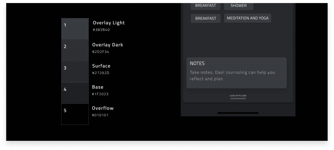
Contrast is super important
If you have dark themes darken the distant surfaces. Farther in the distance they are the darker they get. Do not only invert your light theme. Think from a light source perspective. Also, avoid pure black or white. Lookup black smearing.
Contrast and accessibility goes hand in hand. Think about the difference of colors of the background layer and the text layer. Contrast ratio 7? Way to go! Contrast ratio 3.9? Not good.
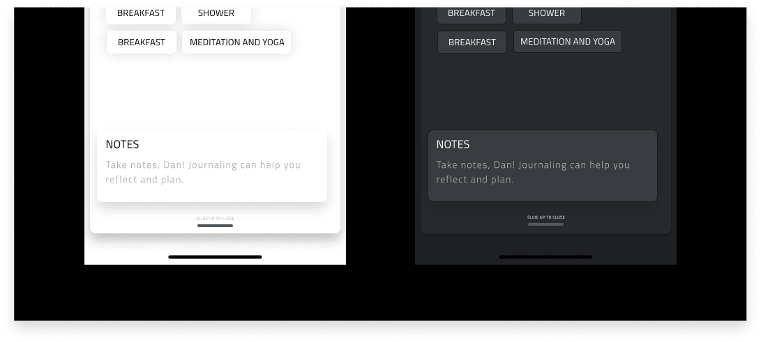
Avoid pure white text on dark background
Pure white on pure dark is the highest contrast possible 21:1 which may sound good in theory, but it can cause eye fatigue and halation. Avoid pure white text. Go with 90% opacity with your whites on a darker background which gets easier to read.
There are many other tips and tricks to better your UI design and process. For now, I could only muster a few of them to share with you people. Hopefully you have taken something valuable from this article.
If you have anything to add feel free to reach out!